The AirDoctor Mobile App was created to extend the capabilities of AirDoctor’s high-performance air purification systems, offering users a smart, connected experience. Designed for health-conscious individuals, families, and those with specific respiratory needs, the app provides remote control, real-time air quality monitoring, and proactive maintenance alerts.
My role was to design a mobile experience that aligns with AirDoctor’s mission of healthier living—ensuring users can manage their indoor air quality with confidence, convenience, and control.
THE PROBLEM
While AirDoctor’s purifiers are highly effective at removing airborne pollutants, users lacked a simple, centralized way to monitor and manage their devices. This led to several pain points:
Limited visibility into real-time air quality levels
No remote access to adjust settings or turn devices on/off while away from home
Unclear filter replacement status, resulting in either premature or delayed changes
No customizable alerts, making it harder for users to respond quickly to air quality changes
As indoor air health becomes more vital, especially for vulnerable populations, the lack of smart control limited the full potential of the AirDoctor system.
RESULTS
The new AirDoctor Mobile App significantly elevated the user experience by integrating smart control, real-time insights, and proactive health tools into a single, intuitive platform. Users can now view real-time air quality dashboards that clearly visualize indoor pollution levels, making it easier to understand and respond to changes in their environment. The app also introduced remote control capabilities, enabling users to manage their AirDoctor units from anywhere. Smart filter monitoring and timely replacement alerts, based on actual usage, help ensure optimal performance, while customizable notifications keep users informed of air quality shifts.
Altogether, the app empowers users to take control of their indoor air, creating a cleaner, safer, and healthier living space for themselves and their families.
MY ROLE
UI/UX
Visual Design
Design Systems
Design Leadership
Design Research
AirDoctor Connected Units
Research & Discovery
User interviews with current AirDoctor owners revealed:
Many rely on visual cues from the device, which can be missed
There’s a strong desire to control and monitor multiple units from a single app
Notifications should be timely, not intrusive
Competitive analysis of smart air purifiers and health monitoring apps guided UI and feature benchmarks
High-Fidelity Design
Seamless Onboarding
Getting started with your AirDoctor has never been easier. The app guides users through a quick, intuitive setup process—connecting devices effortlessly and providing helpful prompts every step of the way. Whether you’re pairing your first unit or managing multiple devices, onboarding is smooth, clear, and user-friendly.
Air Quality Alerts
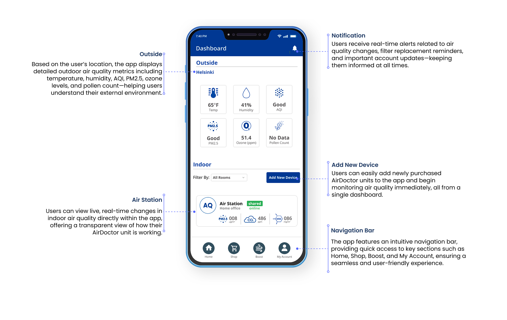
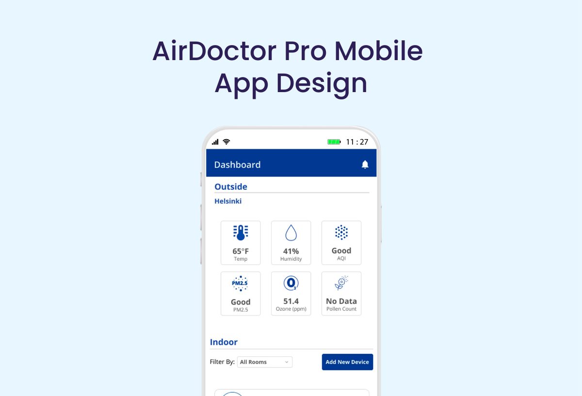
Stay informed with real-time air quality insights. The app provides live data visualizations of indoor air conditions, with customizable alerts when pollution levels rise. Whether you’re home or away, you’ll know exactly when action is needed—ensuring your space remains healthy and safe at all times.
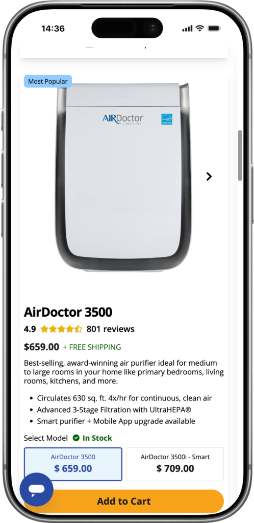
Enhanced Control and Customization
Take full command of your indoor environment. From adjusting fan speeds to activating Auto Mode, the app offers remote access and smart scheduling tailored to your lifestyle. Users can also monitor filter life, receive replacement notifications, and set preferences to optimize performance without the guesswork.
Happy funny family excited little boy playing with father at home, young dad crawling on floor carrying cute small child son on back giving kid piggyback ride having fun spending time together
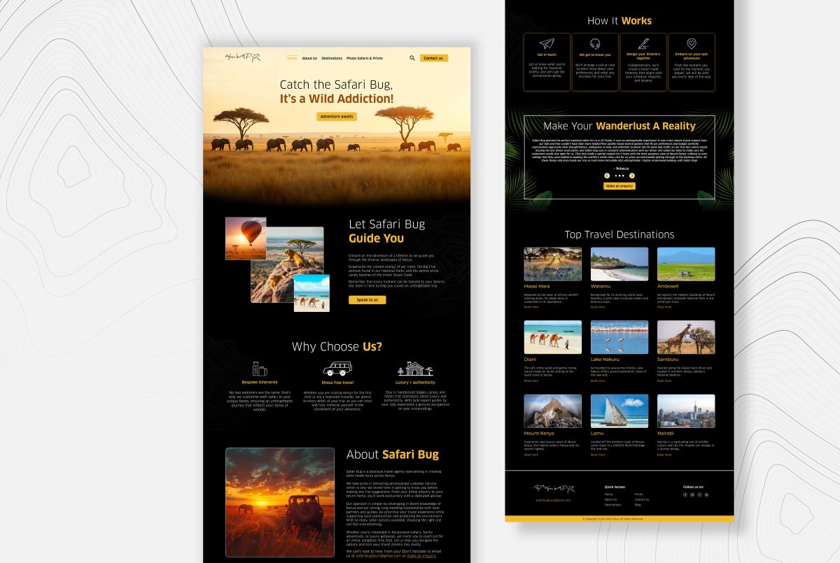
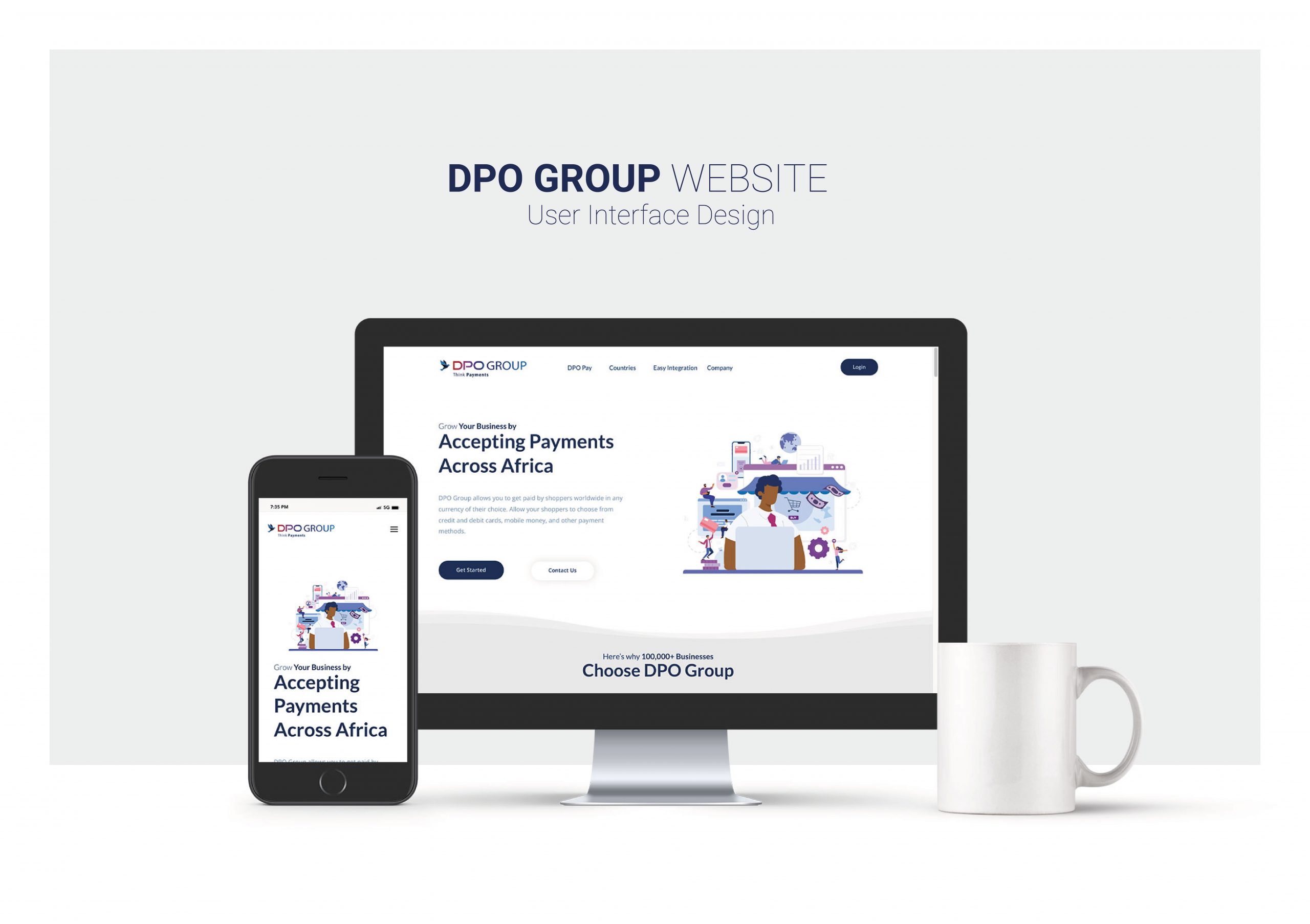
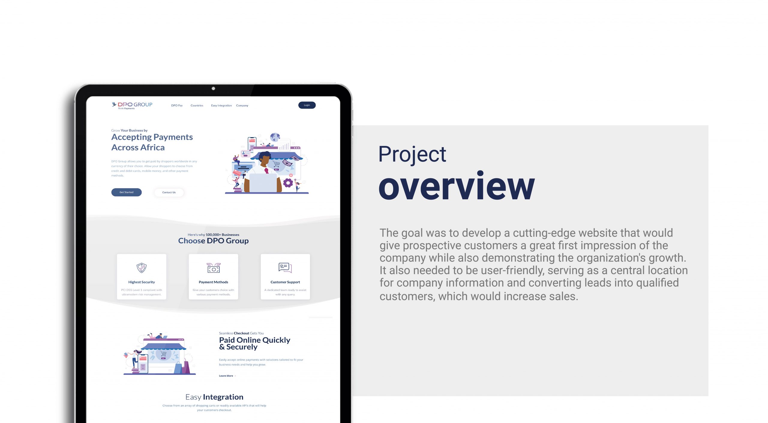
OVERVIEW
AirDoctor is a leading U.S. brand specialising in advanced air purification systems for homes and offices. As a UI/UX designer, I led the website redesign to create a cleaner, more intuitive, and conversion-focused user experience. The project involved improving navigation, streamlining the product discovery flow, and modernizing the overall visual design to better reflect AirDoctor’s premium, health-driven brand identity.
MY ROLE
UI/UX
Visual Design
Design Systems
Design Leadership
Design Research
Problem Statement
The previous AirDoctor website design presented several usability and conversion challenges that affected overall performance.
Previous Homepage Analytics
Exits: A high percentage of visitors dropped off from the homepage, indicating limited engagement and unclear navigation paths.
Scroll Depth: Most users scrolled past the hero section but did not interact further, suggesting weak visual cues and low content engagement.
Conversion Rate: Few visitors added products to cart directly from the homepage, showing friction in the product discovery and purchase flow.
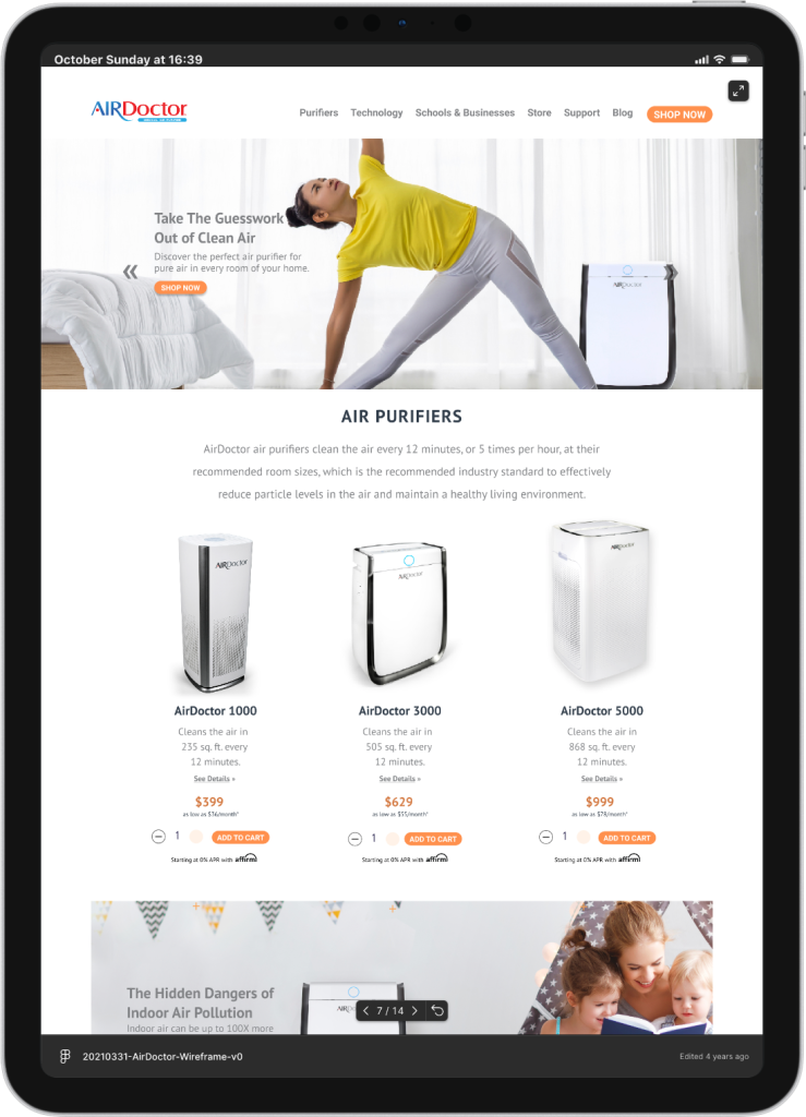
Analysis of the Previous Homepage Design
The previous AirDoctor homepage lacked a clear information hierarchy and failed to effectively communicate the brand’s value proposition. Product categories were buried within the layout, making it difficult for users to differentiate between models and features. The visual design felt outdated and text-heavy, offering little motivation for users to explore or convert.
Summary
AirDoctor needed a complete homepage redesign to improve clarity, enhance product visibility, and create a seamless path to purchase that reflects the brand’s trusted, health-conscious identity.
Solution
Optimized User Flow: Simplified navigation and clearer CTAs to guide users seamlessly from discovery to purchase.
Improved Product Visibility: Highlighted product categories and features for easier comparison and quicker decisions.
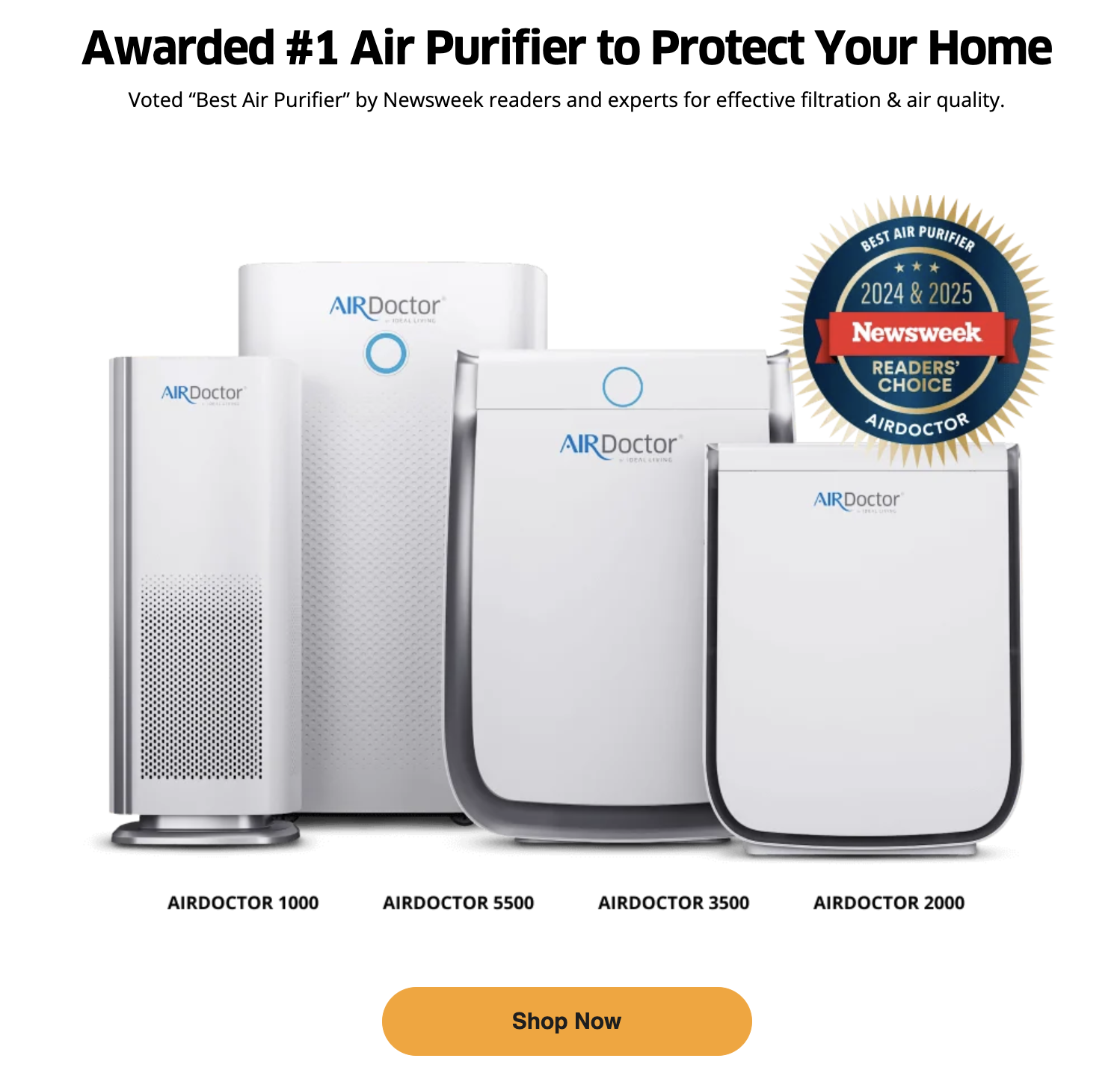
Built Brand Credibility: Integrated testimonials and certifications to reinforce AirDoctor’s reliability and premium value.
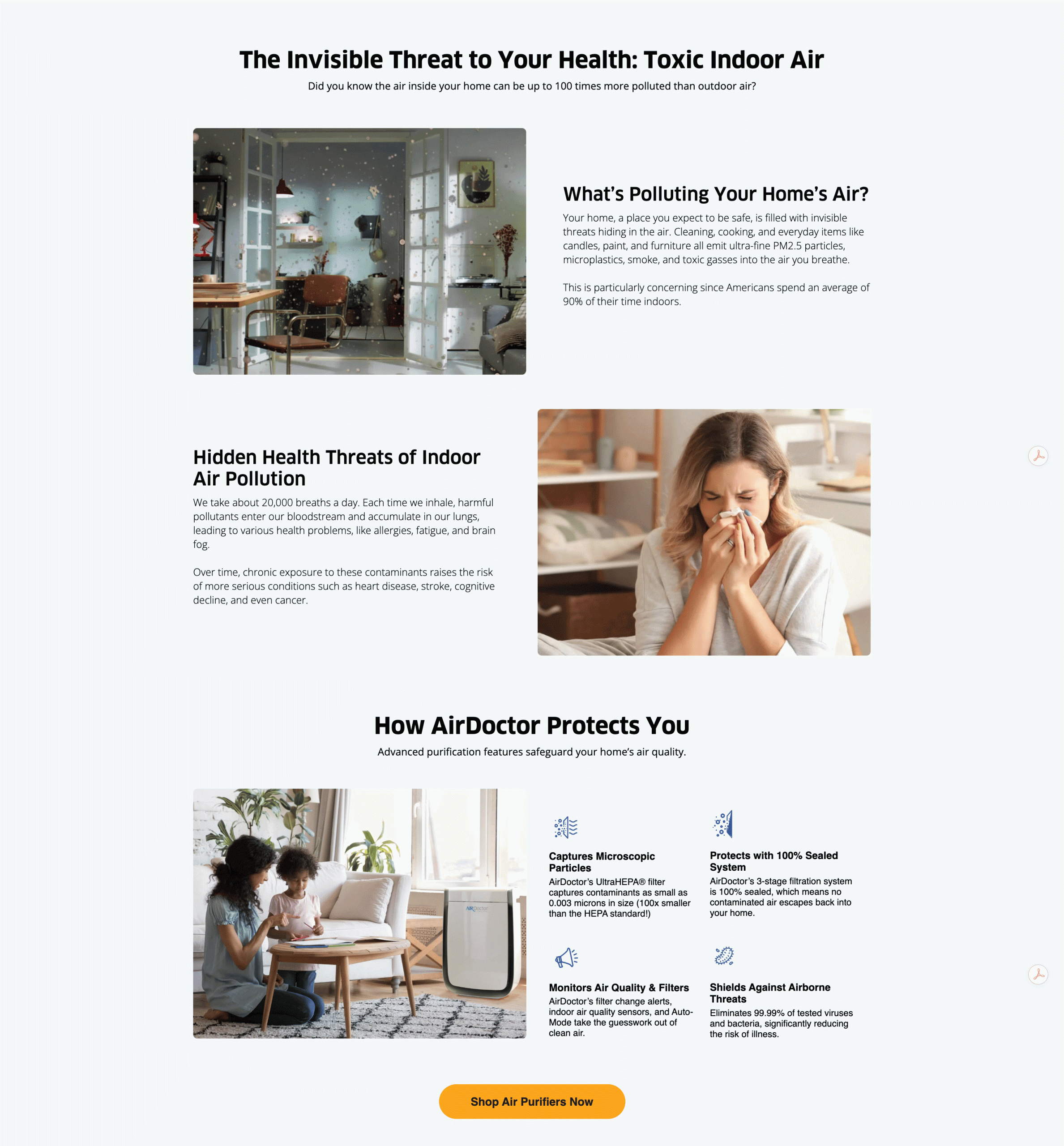
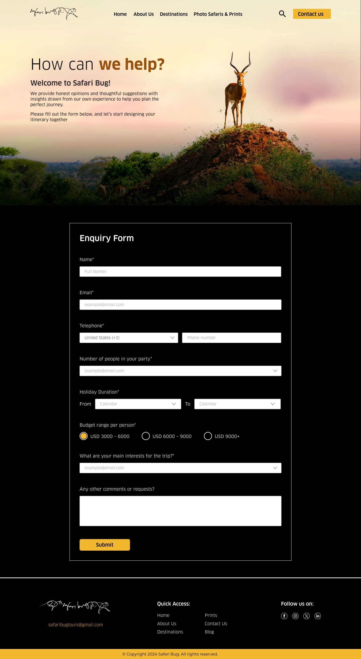
Educational Awareness Section
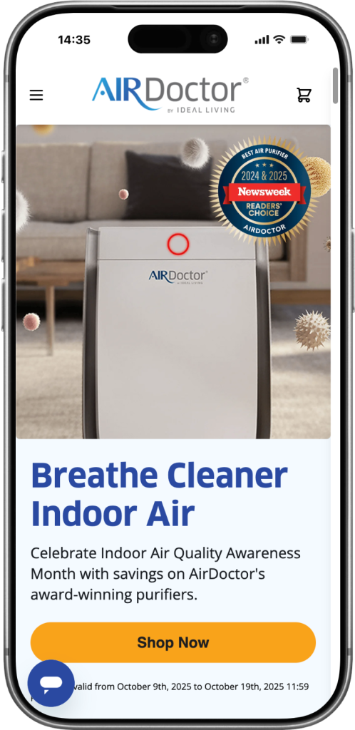
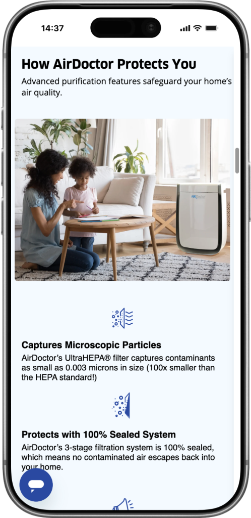
This section was created to inform and engage users by showing the hidden dangers of indoor air pollution and positioning AirDoctor as a trusted solution. It blends clear storytelling with strong visuals, guiding visitors from awareness to action. Concise copy and relatable imagery help build emotional connection and urgency, while improved layout and spacing make the content easy to read. The section ends with a clear call-to-action, encouraging users to explore AirDoctor purifiers and make confident, informed decisions.
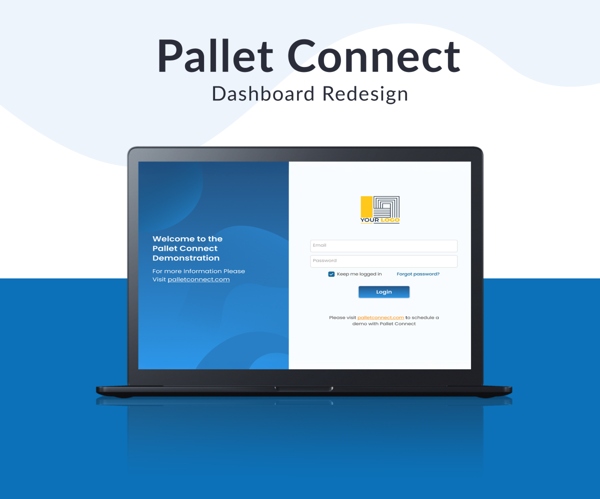
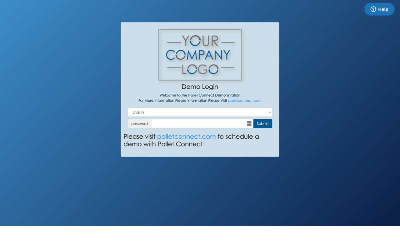
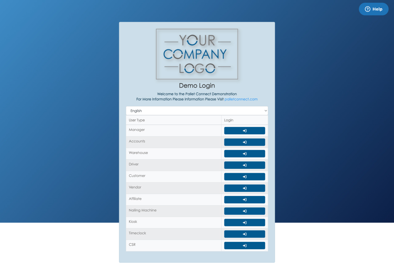
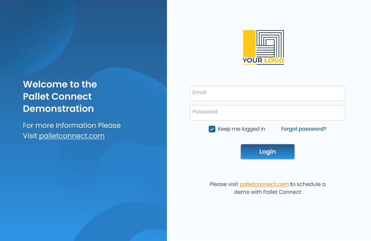
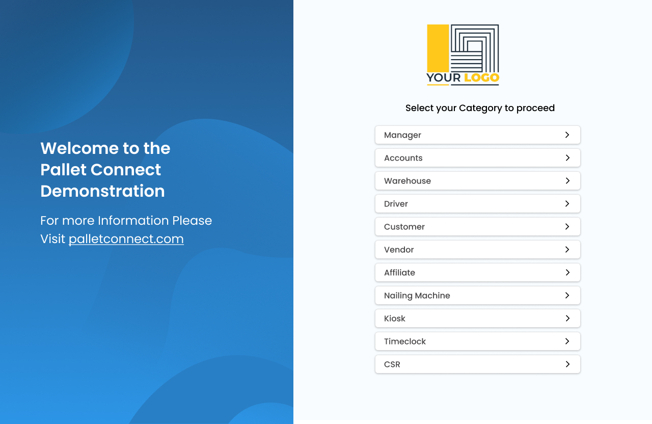
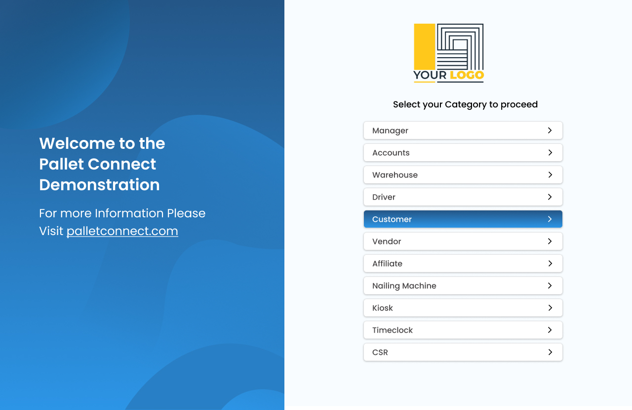
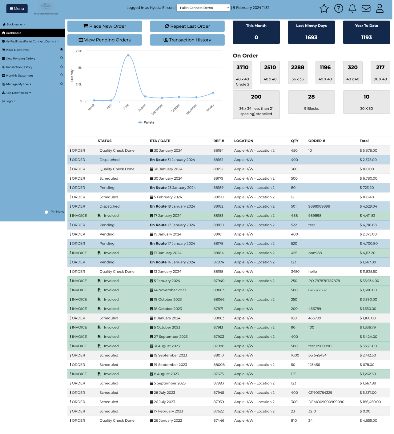
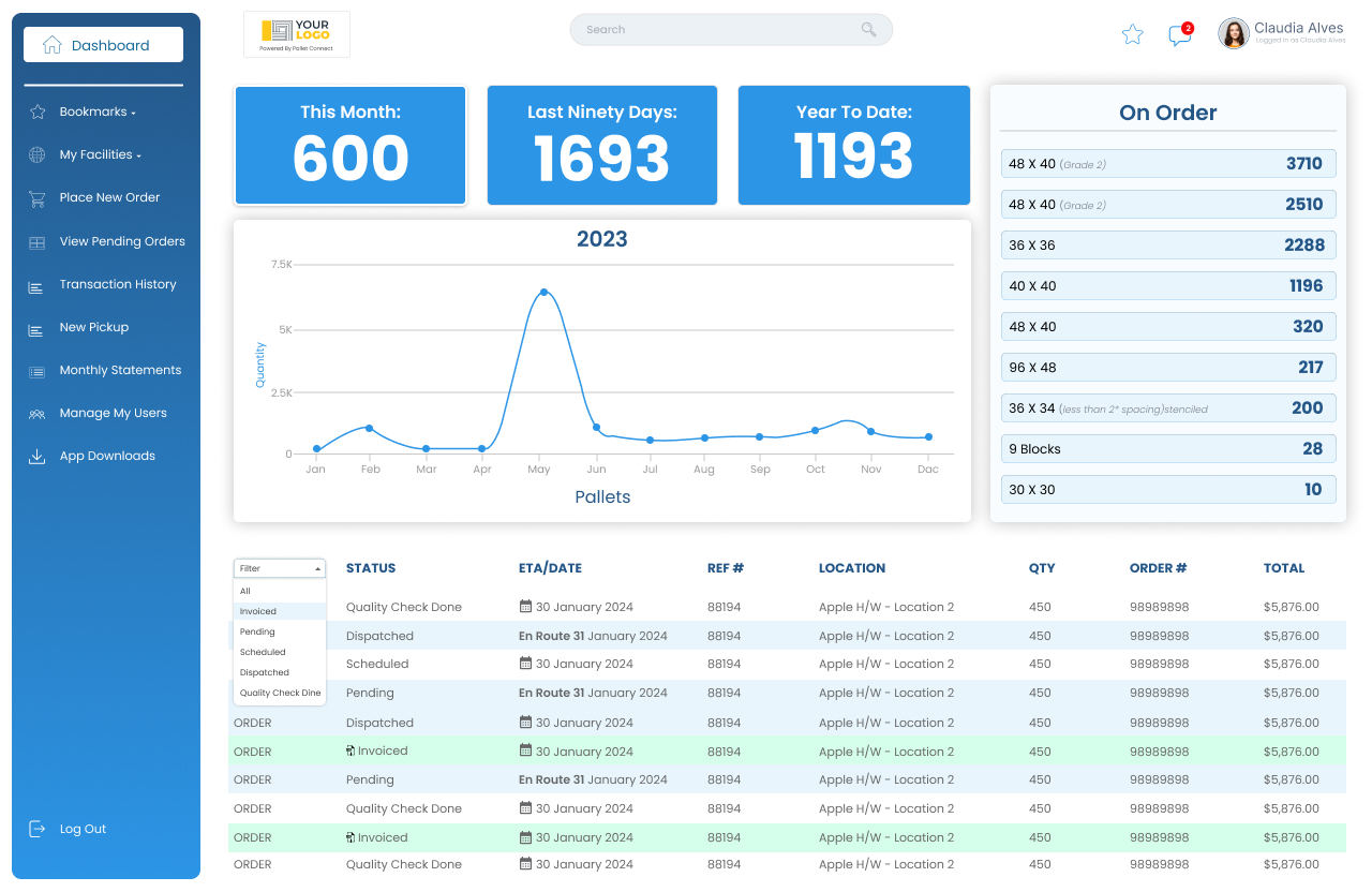
This project's aim was to redesign the Pallect Collect dashboard with a user-centred focus, creating a more intuitive experience by simplifying navigation and enhancing usability while reducing friction, improving aesthetics, and making essential features easily accessible and actionable, leading to a more satisfying user experience.
Tools used: Figma
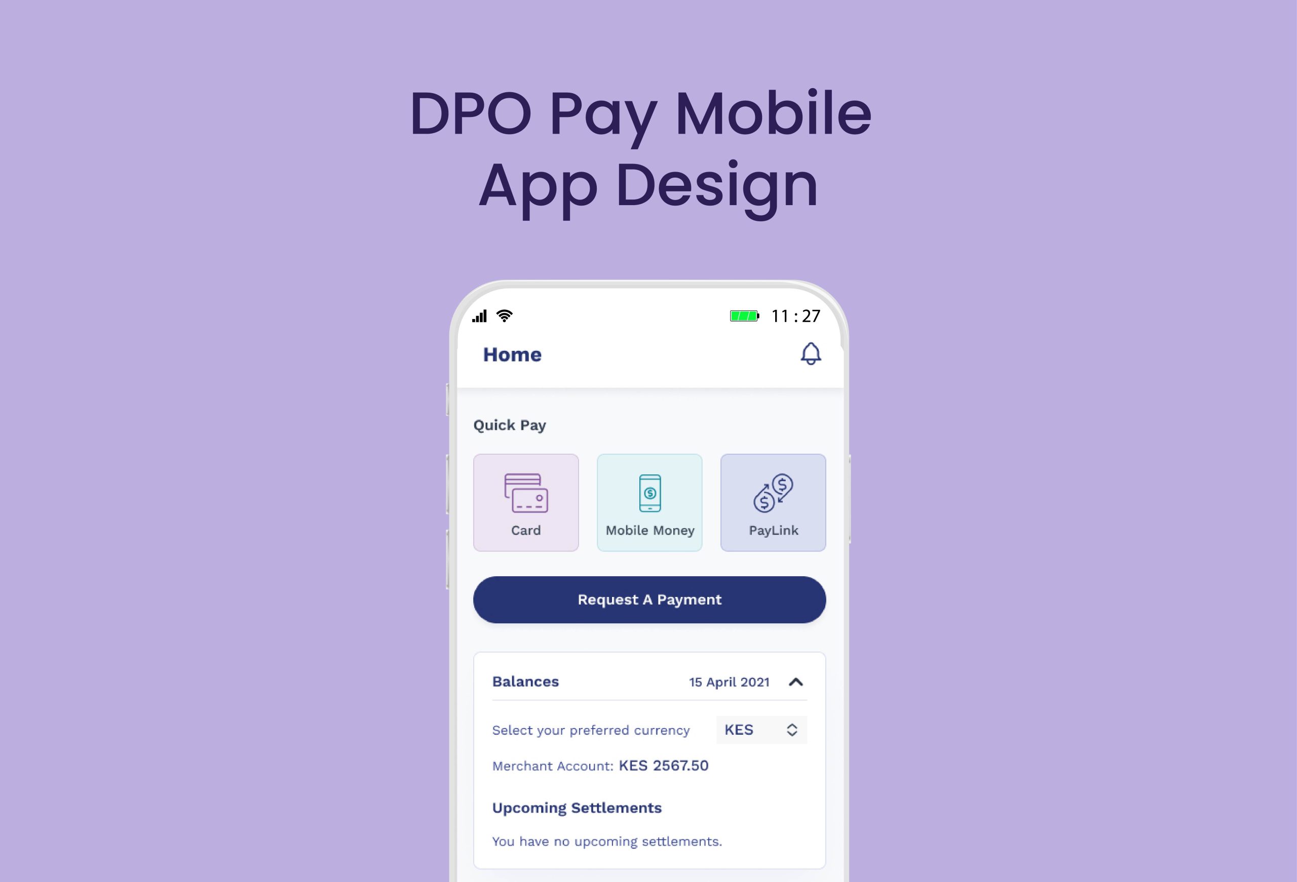
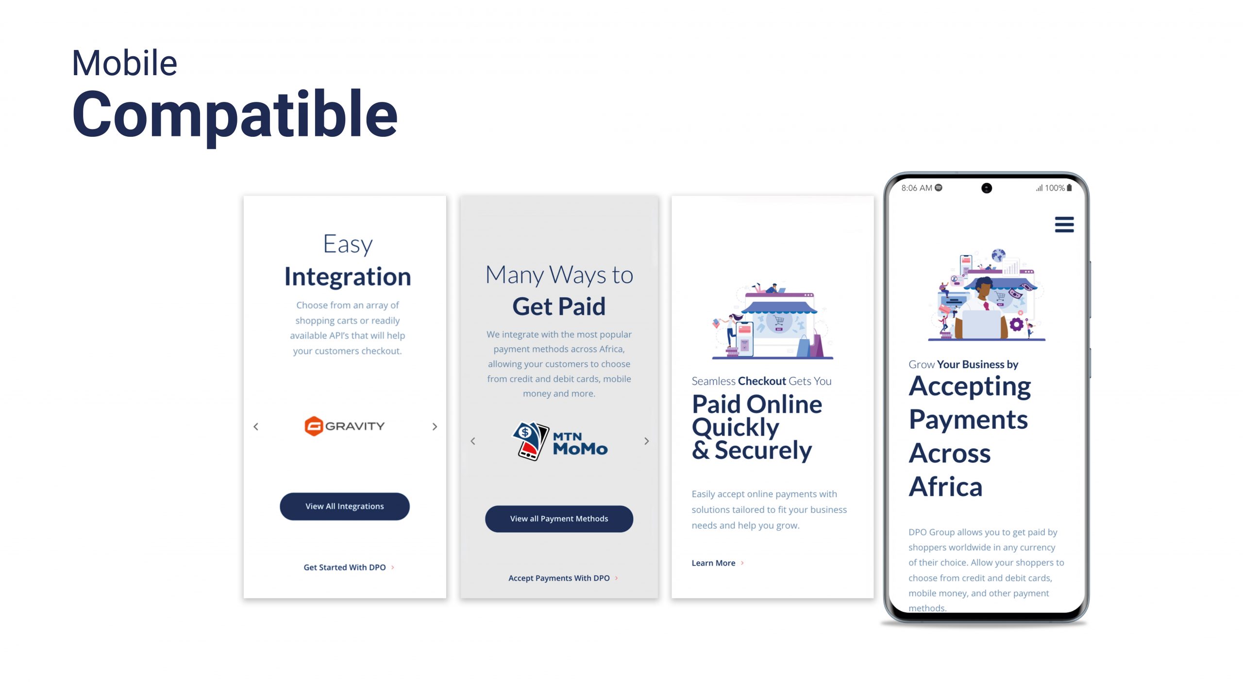
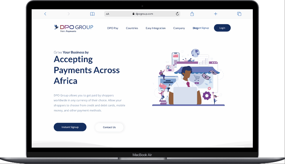
DPO Group, one of Africa’s leading payment service providers, set out to enhance its mobile app experience for merchants across the continent. The goal was to design and optimize the DPO Pay App — a secure, scalable, and easy-to-use mobile platform enabling merchants to accept payments, view real-time transactions, and manage their accounts seamlessly. My role was to lead the UX design process, grounded in user research and aimed at delivering a solution that meets the unique needs of small and medium-sized businesses in Africa.
THE PROBLEM
Despite the growing demand for digital payments, many African merchants struggled with the tools available to them. Existing systems were fragmented and lacked support for various payment methods like cards and mobile money. Merchants also faced:
Outdated and unintuitive mobile interfaces
Limited access to real-time transaction data and daily cash flow
Inability to collect payments on the go
Low trust in digital solutions due to poor usability and performance
These challenges hindered the adoption of digital payments, especially for businesses without technical expertise.
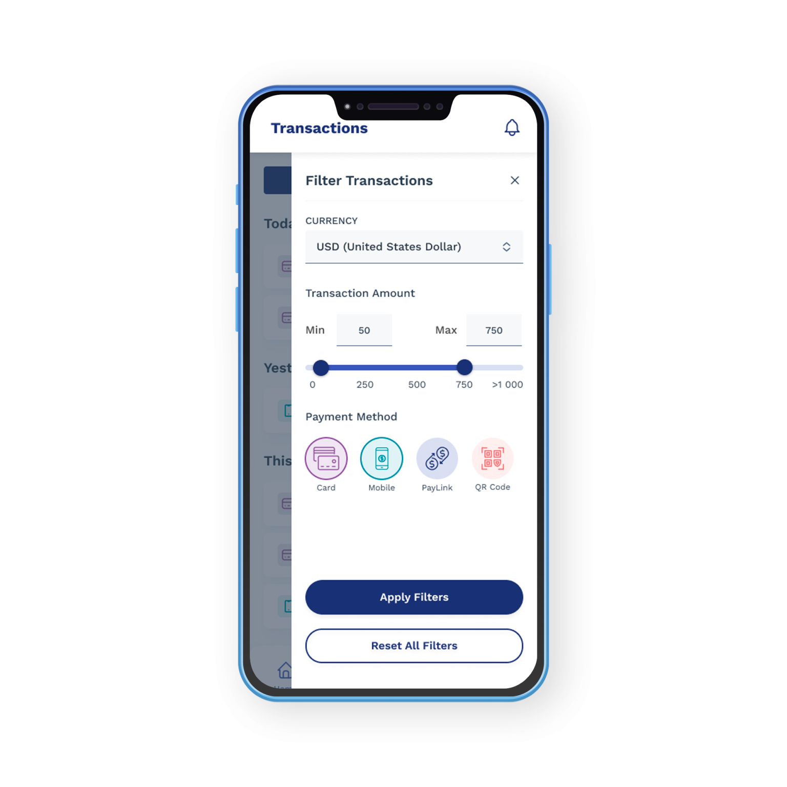
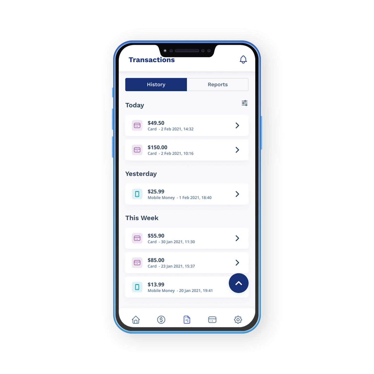
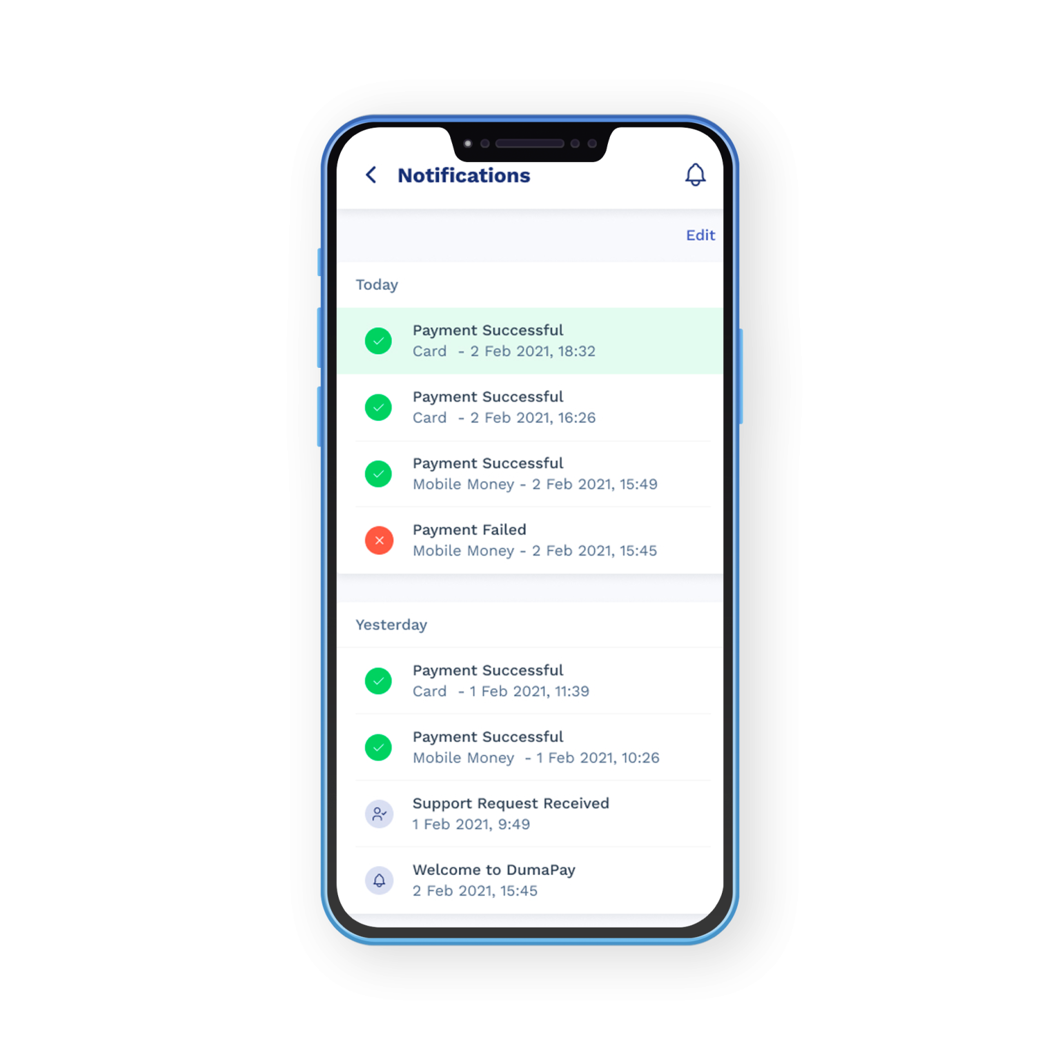
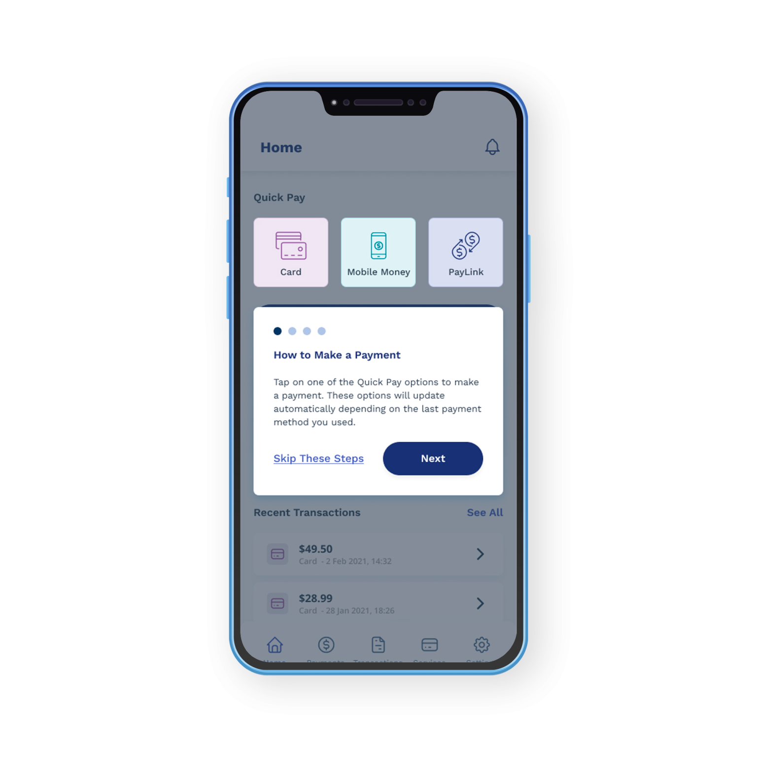
RESULTS
The redesigned DPO Pay App emerged as a one-stop mobile solution for modern African merchants. By integrating multiple payment methods, offering instant payment notifications, and delivering clear, accessible transaction data, the app significantly improved merchant confidence and adoption. Through user-centric design and continuous feedback from businesses in retail, hospitality, and services, the app delivered a simplified, intuitive experience that empowered merchants to operate efficiently, anytime and anywhere.
MY ROLE
UI/UX
Visual Design
Design Systems
Design Leadership
Design Research
Approach
To design a solution that truly meets the needs of business owners, we began with in-depth user research across several key African markets. We interviewed merchants from various sectors—retail, hospitality, services, and more—to understand their day-to-day challenges, expectations, and habits around receiving payments.
The findings revealed a strong demand for simplicity, flexibility, and trust in digital transactions. Merchants wanted a single platform that could accommodate multiple payment channels, provide instant payment notifications, and offer clear transaction summaries without the need for technical know-how.
Understanding User and Pain Points
Suleiman Abdu Said
Location: Stone Town, Zanzibar
Business: Mid-sized Swahili restaurant catering to locals and tourists
Tech Savviness: Moderate – uses mobile money and WhatsApp for communication
Preferred Language: Swahili & basic English
User Persona: Suleiman Restaurant Owner, Zanzibar
Suleiman runs a popular restaurant in Stone Town that attracts both locals and tourists. His business is growing, but managing payments—especially from tourists using international cards or mobile wallets—has become increasingly difficult. He wants a reliable, easy-to-use payment system that doesn’t interrupt her customer flow and helps her track her sales better.
Frustrations
Cannot accept card payments consistently due to unreliable POS machines
Has to track payments manually, leading to errors and loss of income
Mobile money requires her personal number, which blurs the line between personal and business finances
Tourists often ask for payment links, which she currently can’t generate
Goals
Accept card and mobile money payments seamlessly
Keep business and personal transactions separate
Track daily sales and generate simple reports
Offer payment flexibility to customers (especially tourists)
Grace Atieno
Location: Nairobi, Kenya
Business: Small neighbourhood toy store
Tech Savviness: High – active on social media and uses mobile apps for business
Preferred Language: English & Kiswahili
User Persona: Grace Atieno – Toy Shop Owner, Nairobi
Brian runs a small toy shop in a busy Nairobi estate. He markets his products through Instagram and WhatsApp, receiving many inquiries from parents who prefer to pay remotely. He’s a hands-on entrepreneur looking to scale his business by offering digital payment options and streamlining how he handles money.
Frustrations
Relies on manual payment confirmations via mobile money
Loses customers when he can’t offer convenient digital payment options
No access to a simple app that tracks payments in one place
Finds it hard to reconcile payments from multiple sources at the end of the day
Goals
Send secure payment links to customers via WhatsApp or SMS
Accept mobile money and card payments from both walk-in and online customers
Track and reconcile all payments in one place
Grow trust with customers by looking more professional and streamlined
Information Architecture & User Flow
To ensure business owners could access key features quickly and intuitively, we focused on thoughtful idea generation grounded in real user needs. Based on insights gathered from our research, we mapped out the information architecture and user flow to create a smooth, efficient experience. This helped ensure that actions like accepting payments, viewing transactions, and generating payment links were simple, accessible, and friction-free for all users.
Design System
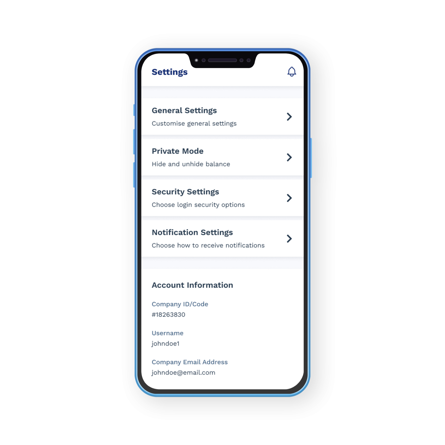
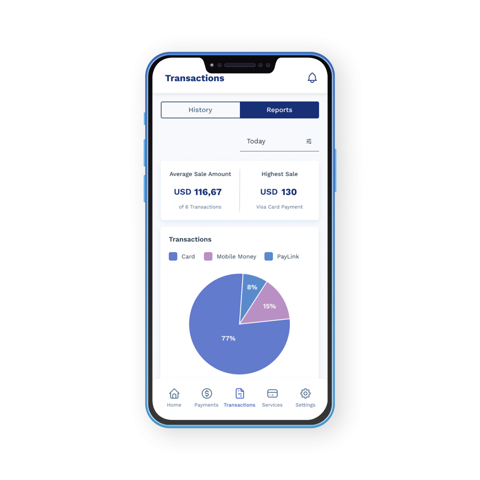
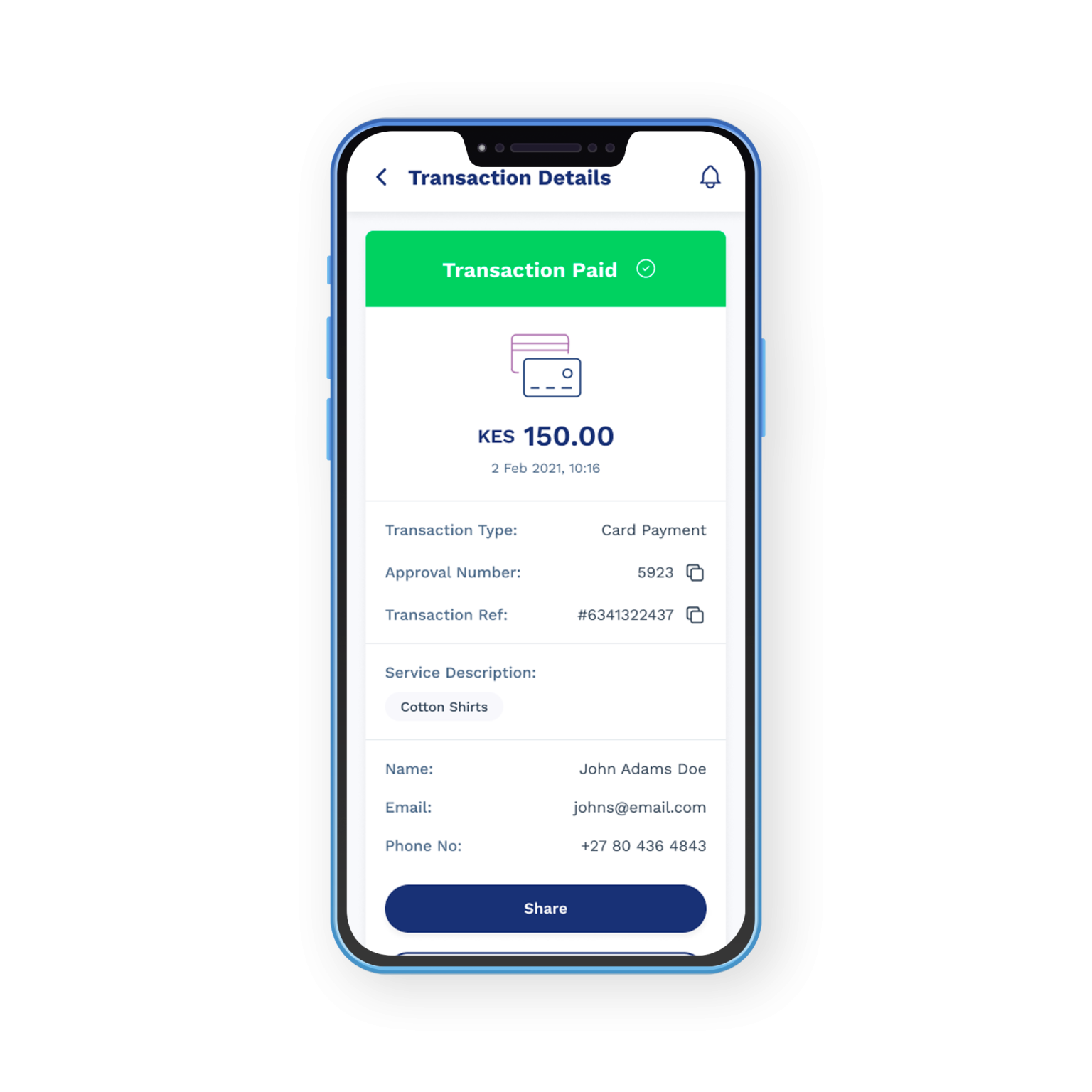
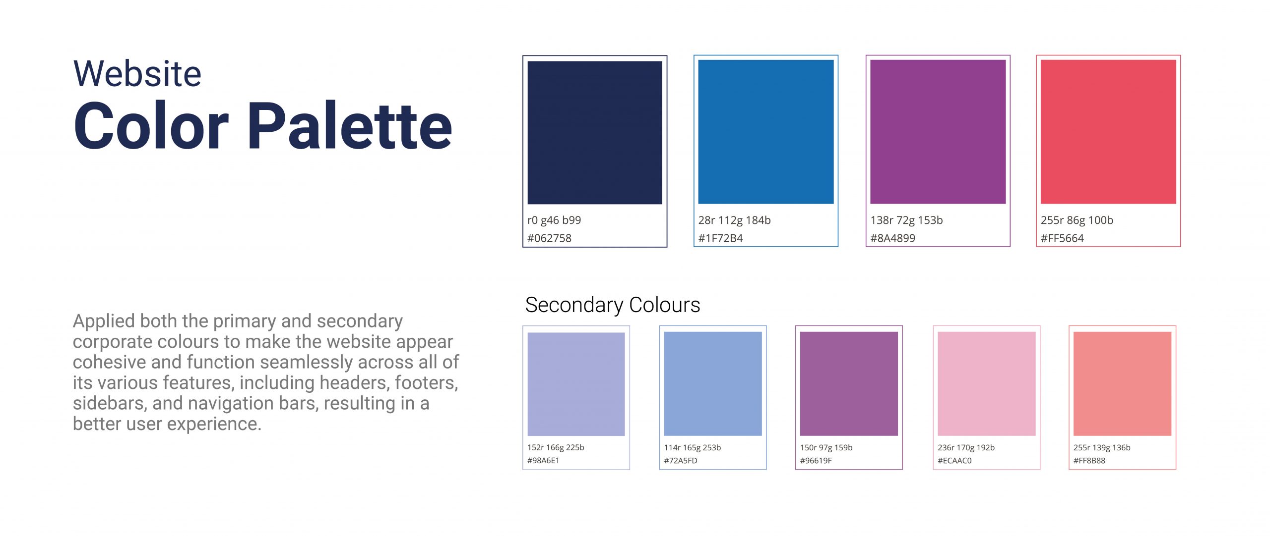
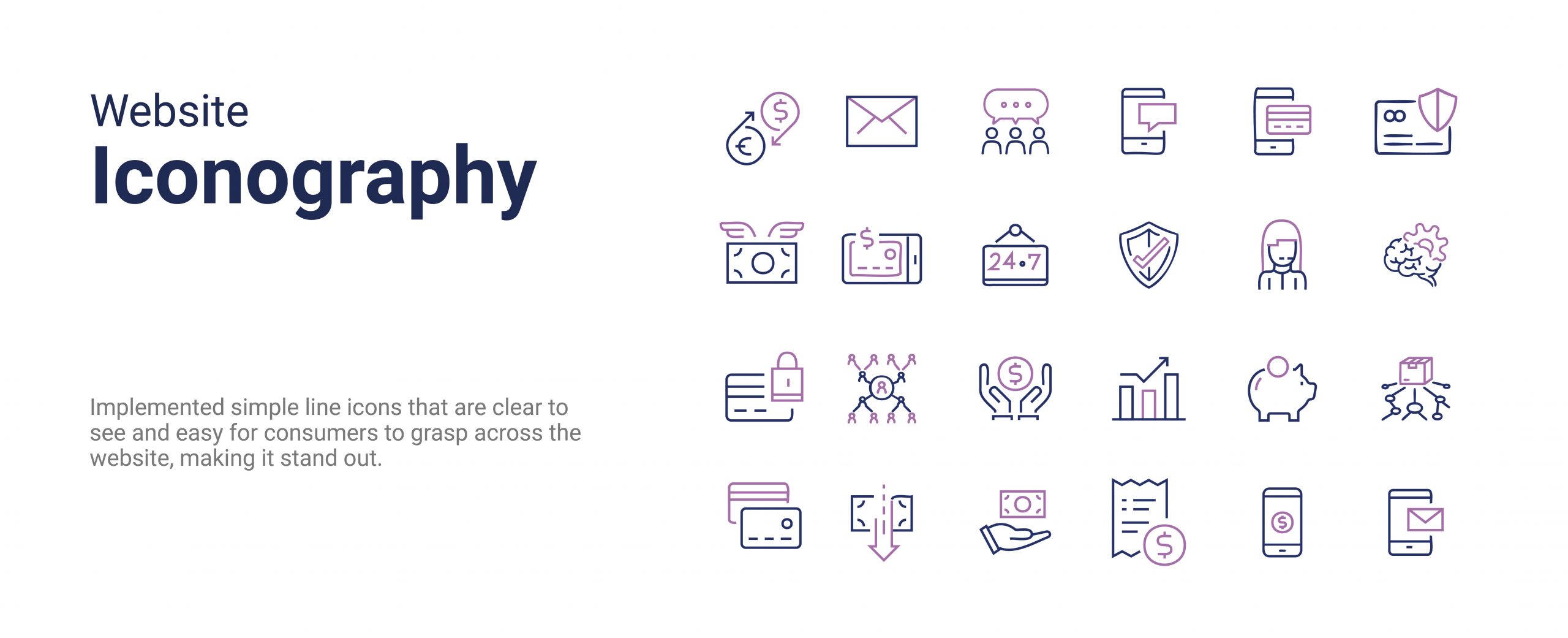
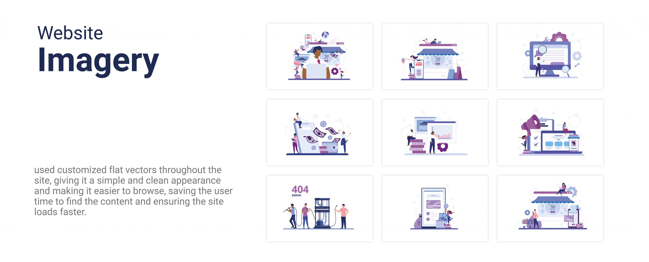
To ensure consistency, scalability, and efficiency in the app’s development and user experience, I created a comprehensive design system specifically tailored for the DPO Pay App. This system included a unified set of components, typography, color schemes, iconography, and interaction patterns — all optimized for mobile environments and the needs of African merchants.
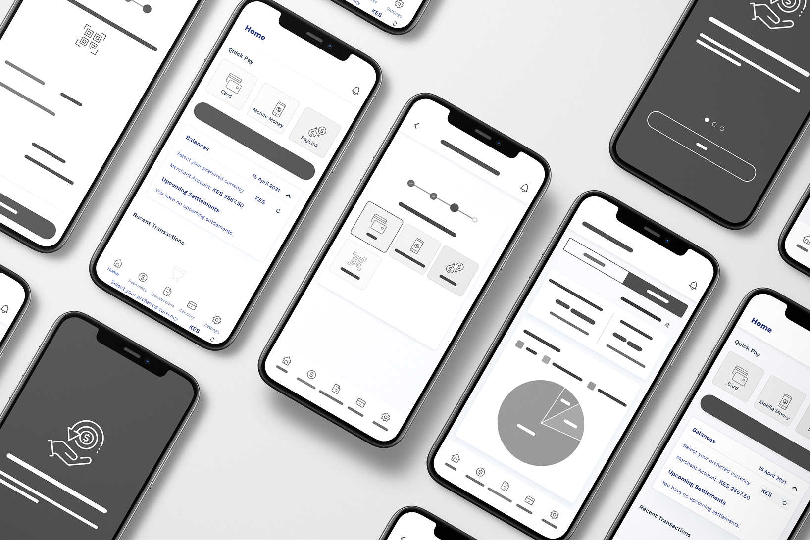
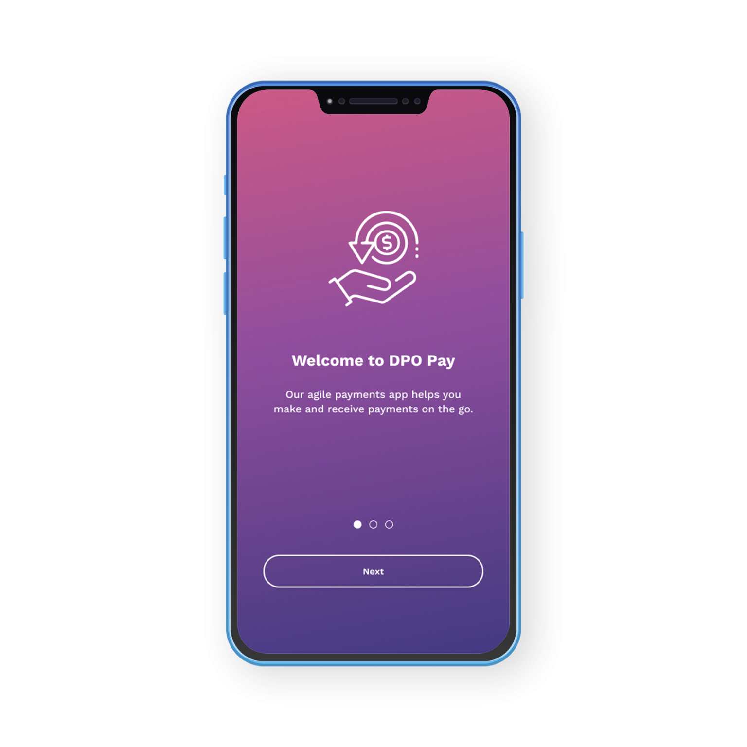
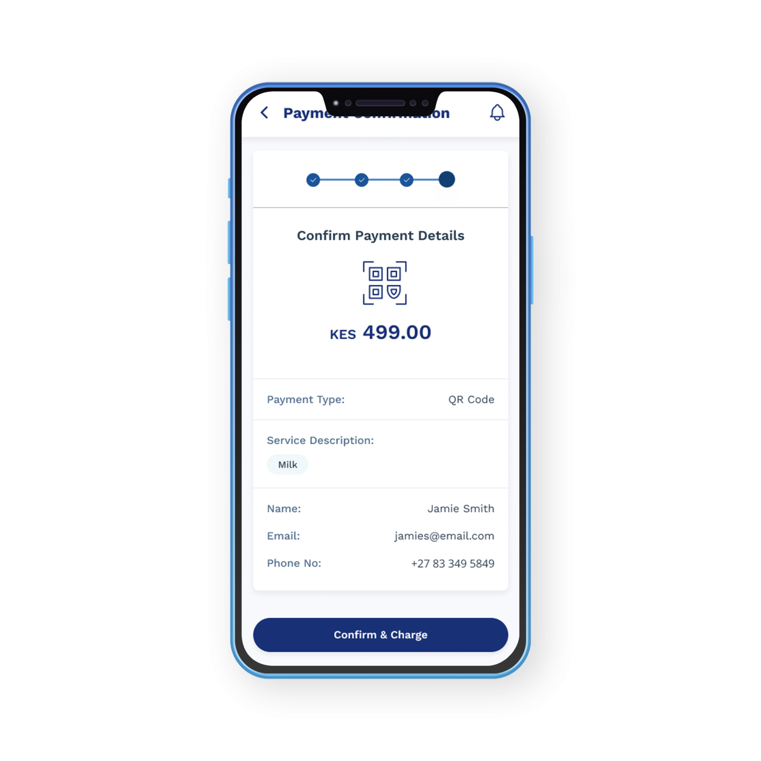
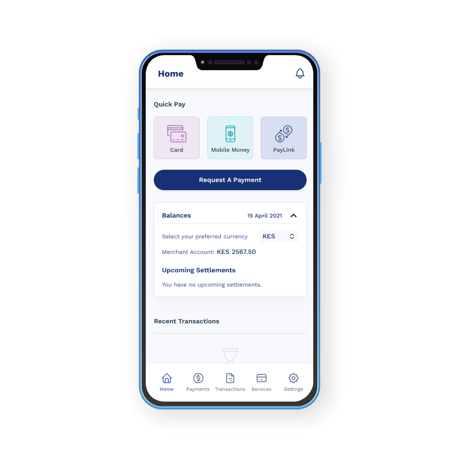
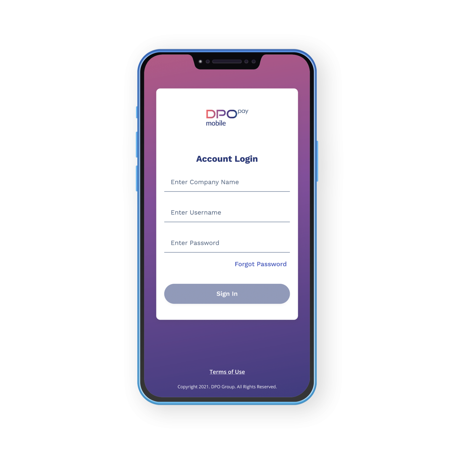
High-Fidelity Wireframes
High-Fidelity Design
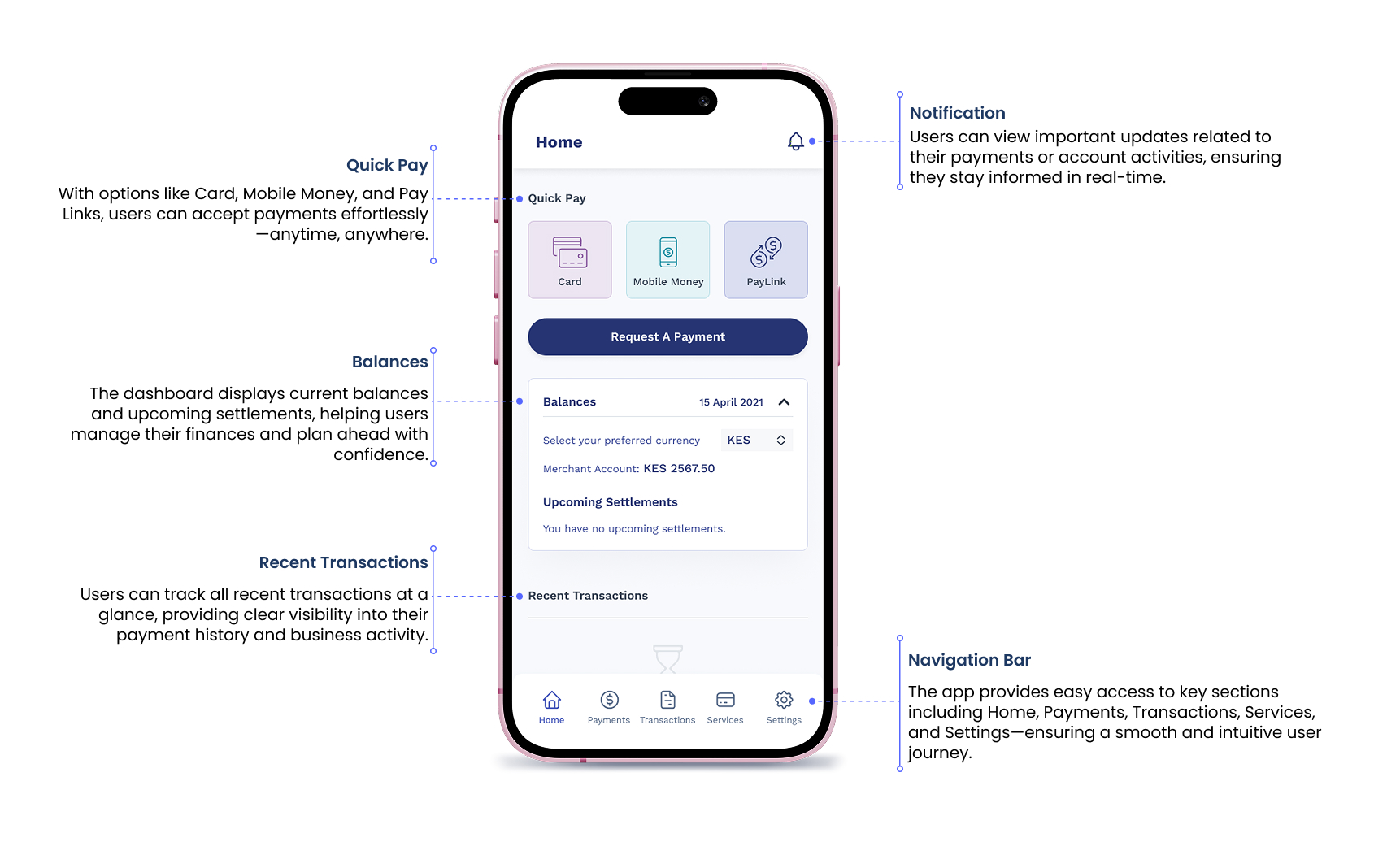
Designed for Merchants.
Built for Africa.
The DPO Pay App is designed around real merchant needs—intuitive, flexible, and reliable. Its clean interface and seamless experience make it easy for businesses across Africa to accept payments, track transactions in real time, and operate with confidence anytime, anywhere.
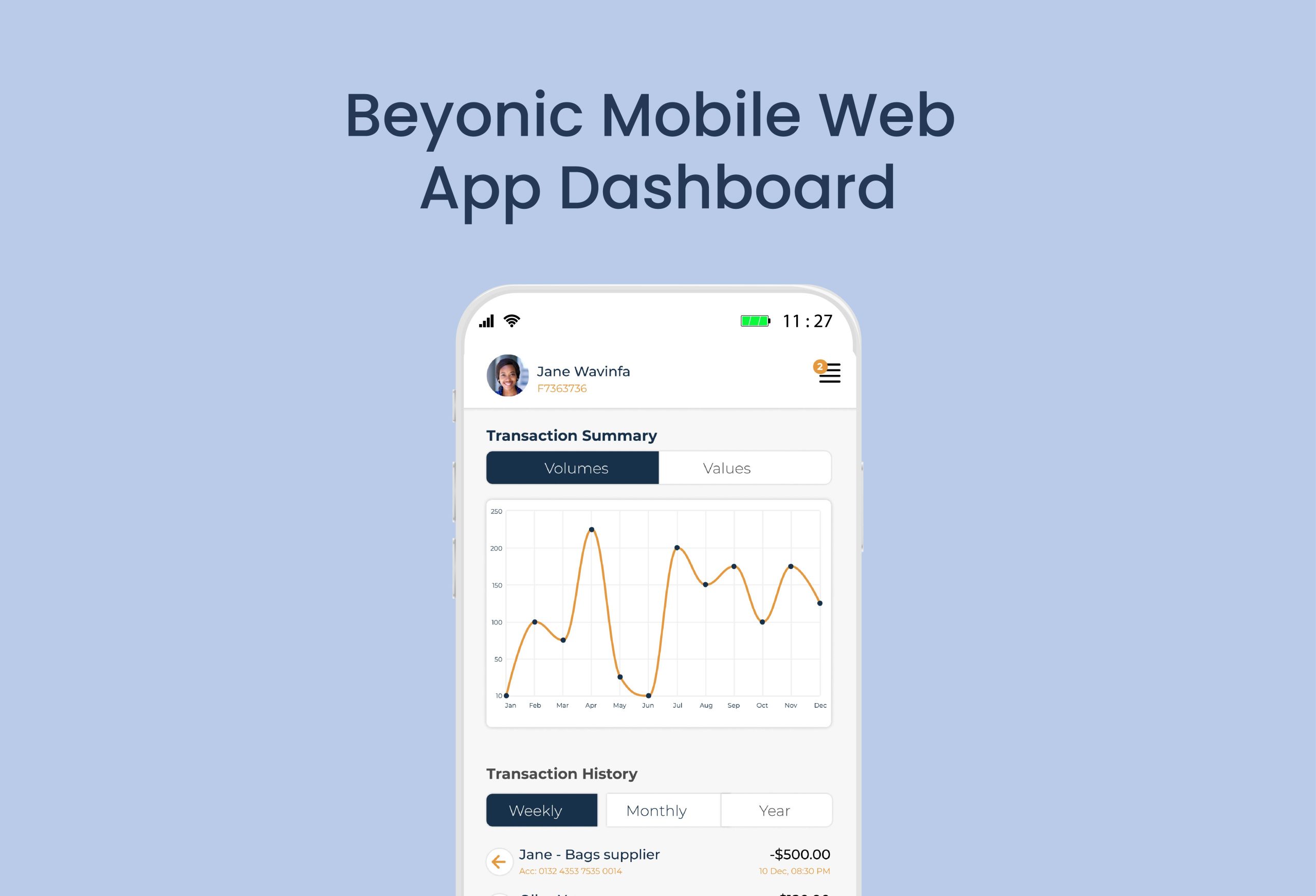
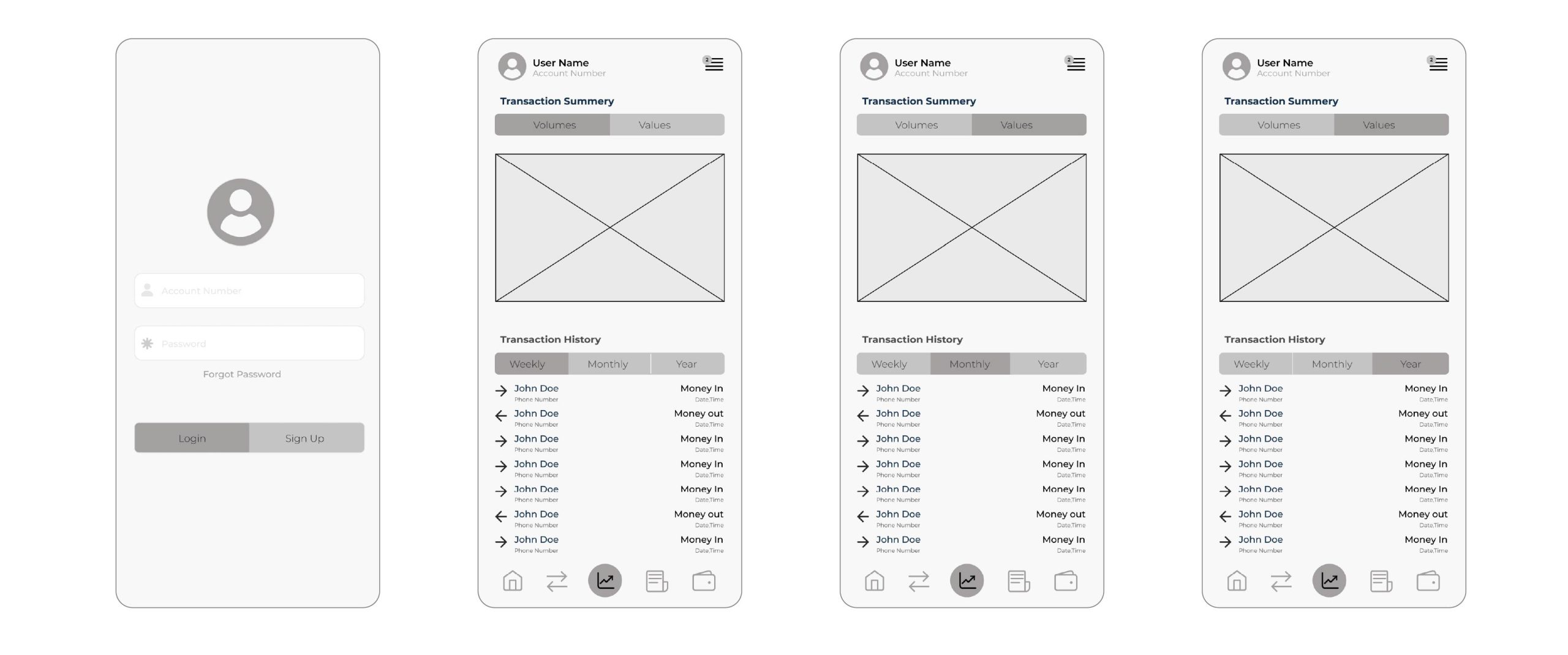
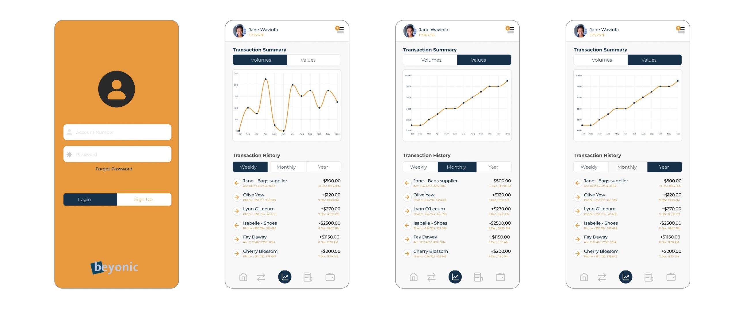
I was approached by Beyonic, a SaaS payments company serving small to medium enterprises in East Africa, to design and develop a web-based mobile app dashboard. The goal was to create a user-friendly interface that enables businesses to manage outgoing payments to employees, vendors, and beneficiaries, as well as receive incoming collections from clients. My role involved building an intuitive dashboard that integrates seamlessly with banks and mobile money operators (MNOs), providing real-time transaction tracking, simplified reporting, and easy navigation for end users.
THE PROBLEM
Beyonic needed a streamlined, mobile-friendly dashboard to simplify how businesses in East Africa manage digital payments and collections. The existing tools lacked the flexibility and user experience required for efficient, real-time financial transactions across multiple banks and mobile money operators (MNOs). Businesses were facing challenges with fragmented systems, limited visibility into transaction flows, and a lack of intuitive reporting tools tailored for mobile access.
RESULTS
The web-based mobile app dashboard I developed delivered a cohesive and intuitive interface that significantly improved how users manage payments and collections on the go. The new dashboard enabled real-time tracking of transactions, seamless integration with banks and MNOs, and easy-to-use reporting tools. This enhanced user experience empowered Beyonic’s clients to operate more efficiently and confidently within the digital payments ecosystem.
MY ROLE
UI/UX
Visual Design
Design Systems
Design Leadership
Design Research
Understanding User and Pain Points
Jane Wavinfa
Age: 36 years Hometown: Mombasa, Kenya Family: Wife & mother of 2 boys Occupation: Business woman
User Persona: Jane
Jane is an entrepreneur who owns three fashion boutiques in the city. Because she frequently travels to source unique products for her customers, she relies on her staff to manage day-to-day operations. Lately, Jane has noticed a drop in sales across all three locations. However, without a reliable system to track transactions and monitor activity remotely, she’s unable to identify the root cause of the issue.
Frustrations
Not being able to monitor my business has led to financial losses. Now I’m facing the possibility of taking out a loan just to stabilize things.
Goals
Jane wants a simple and efficient way to track her business transactions in real time.
She needs to access this information from her mobile device, especially when she’s away.