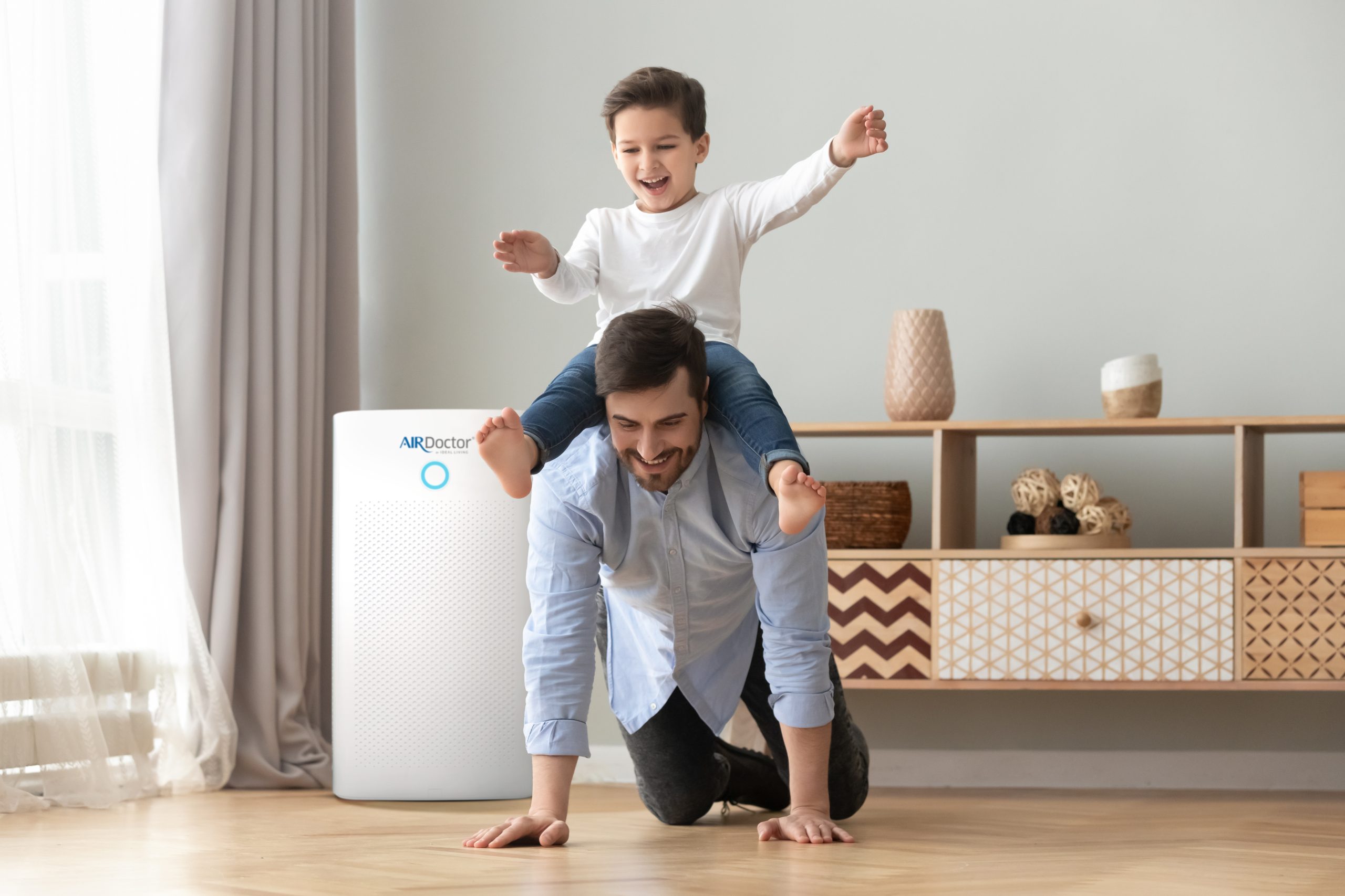
AirDoctor is a leading U.S. brand specialising in advanced air purification systems for homes and offices. As a UI/UX designer, I led the website redesign to create a cleaner, more intuitive, and conversion-focused user experience. The project involved improving navigation, streamlining the product discovery flow, and modernizing the overall visual design to better reflect AirDoctor’s premium, health-driven brand identity.
MY ROLE
UI/UX
Visual Design
Design Systems
Design Leadership
Design Research
Problem Statement
The previous AirDoctor website design presented several usability and conversion challenges that affected overall performance.
Previous Homepage Analytics
Exits: A high percentage of visitors dropped off from the homepage, indicating limited engagement and unclear navigation paths.
Scroll Depth: Most users scrolled past the hero section but did not interact further, suggesting weak visual cues and low content engagement.
Conversion Rate: Few visitors added products to cart directly from the homepage, showing friction in the product discovery and purchase flow.
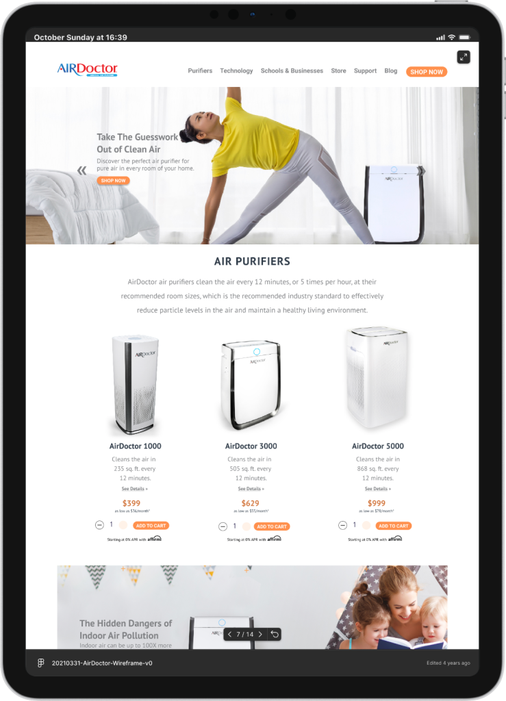
Analysis of the Previous Homepage Design
The previous AirDoctor homepage lacked a clear information hierarchy and failed to effectively communicate the brand’s value proposition. Product categories were buried within the layout, making it difficult for users to differentiate between models and features. The visual design felt outdated and text-heavy, offering little motivation for users to explore or convert.
Summary
AirDoctor needed a complete homepage redesign to improve clarity, enhance product visibility, and create a seamless path to purchase that reflects the brand’s trusted, health-conscious identity.
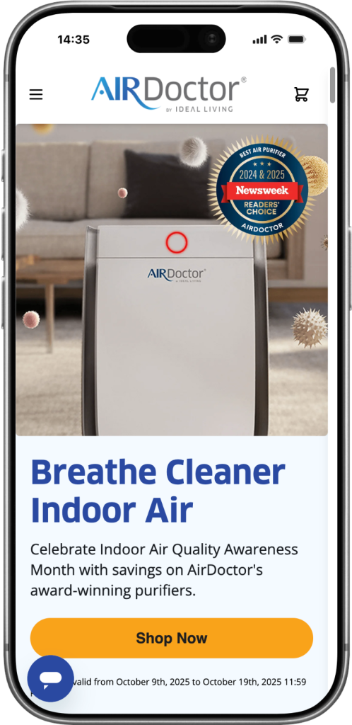
Solution
Optimized User Flow: Simplified navigation and clearer CTAs to guide users seamlessly from discovery to purchase.
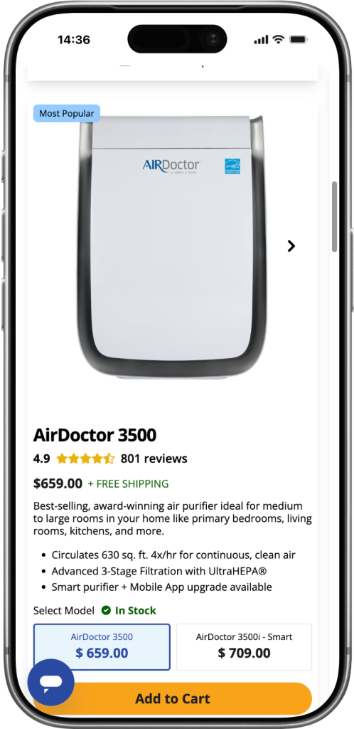
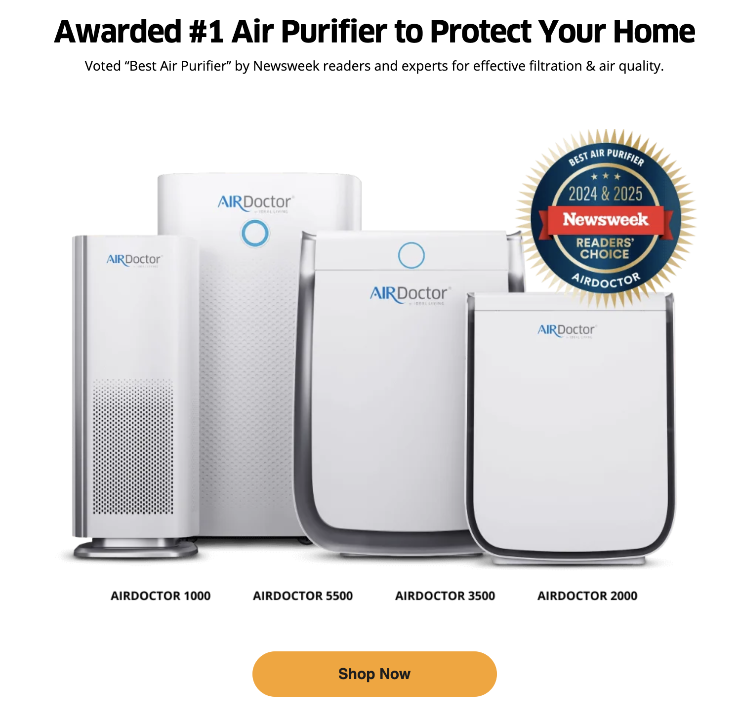
Improved Product Visibility: Highlighted product categories and features for easier comparison and quicker decisions.
Built Brand Credibility: Integrated testimonials and certifications to reinforce AirDoctor’s reliability and premium value.
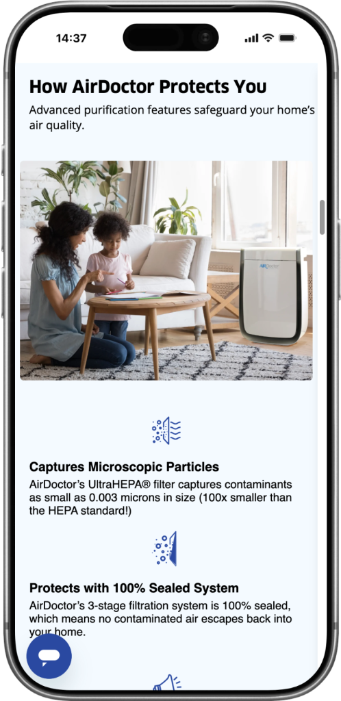
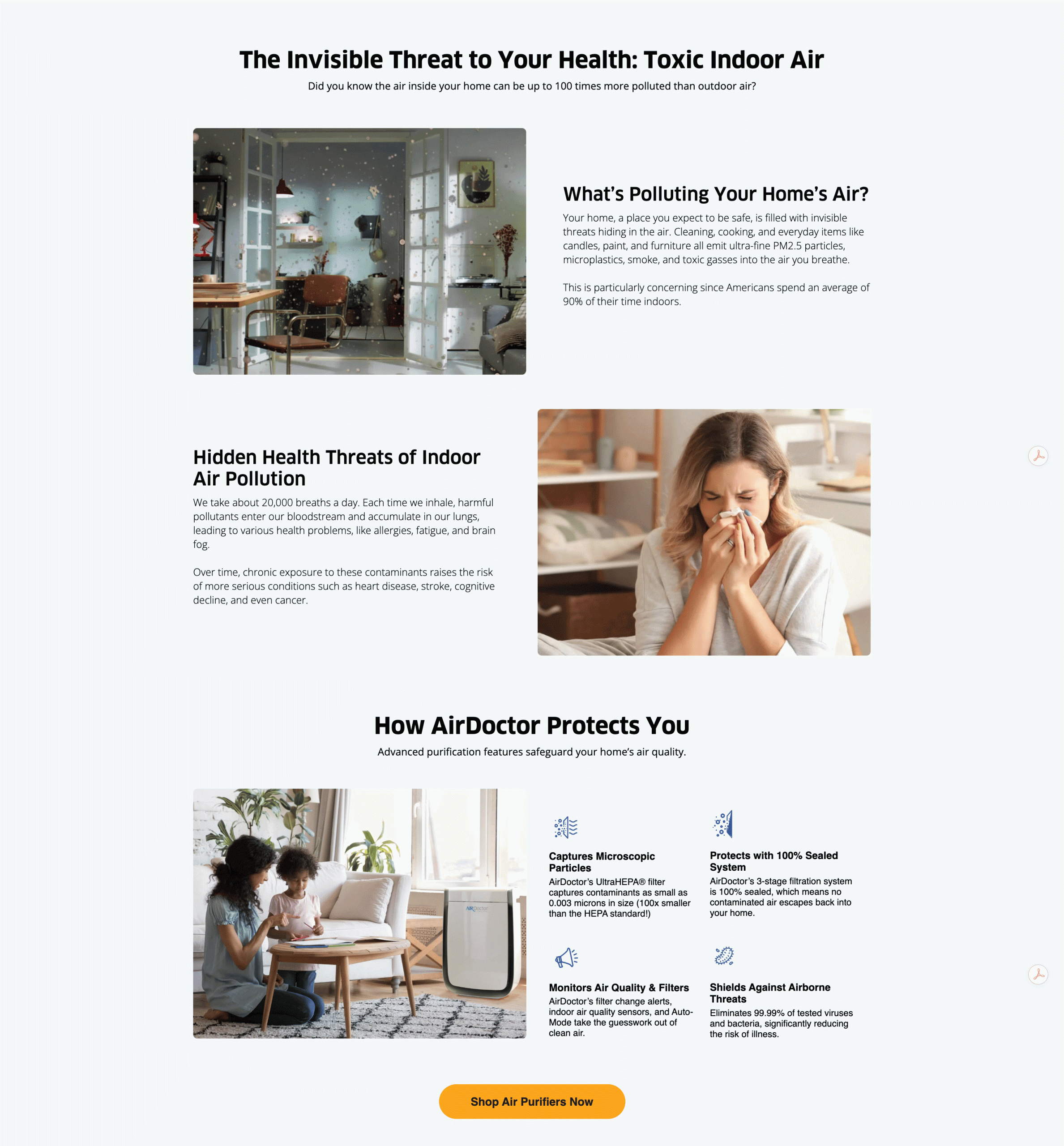
Educational Awareness Section
This section was created to inform and engage users by showing the hidden dangers of indoor air pollution and positioning AirDoctor as a trusted solution. It blends clear storytelling with strong visuals, guiding visitors from awareness to action. Concise copy and relatable imagery help build emotional connection and urgency, while improved layout and spacing make the content easy to read. The section ends with a clear call-to-action, encouraging users to explore AirDoctor purifiers and make confident, informed decisions.